Cryptocurrency has been all over the news since its inception in 2009. Since then, around 4,000 different cryptocurrencies have been available on the market. With many different altcoins around, each one developed its own logo to differentiate it from the rest. In marketing and advertising, brand symbols are elevated to holy grail status as it is the symbol of a brand, a company, or organization. Sometimes, the logos make or break a brand.
Let’s take a look at the different cryptocurrency logos from a designer’s viewpoint.
Bitcoin logo
![]()

When you talk about cryptocurrency, the first thing that comes to mind is Bitcoin. That is understandable since Bitcoin was the very first one that came out. Its logo is quite straightforward. It looks like the dollar sign except for the B and the italicized font. Because the logo is simple, it is easy to spot and recognize. The recall is quite high in the minds of the public. The con is that it may seem too generic. Aesthetically speaking, the logo and brand name have different sizes, and they have different font types, which can be unnerving.
Ripple logo
![]()
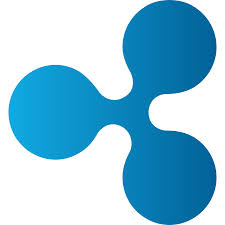
Ripple took Bitcoin’s business idea and pushed it to another level. Not only is it traded but Ripple also acts as a middleman, making digital transactions seamless by bridging the gap between banks, payment providers, and companies. With their business very clearly defined, they came up with a logo that undoubtedly personifies them as a brand. Their logo is composed of 3 interconnected blue dots, which gives a clear picture of how they connect different parties in terms of financial transactions. The use of blue signifies trust and wisdom. What’s more, their logo is quite unique and has high brand recall. It is the perfect example of what a logo should be.
Litecoin logo


Very much like Bitcoin in terms of use and transactions, it came out 2 years after Bitcoin but it is better in terms of transaction processing speed and coin quantity. While it may perform better than Bitcoin, its logo has much to be desired. Its logo pattern is quite similar to Bitcoin’s. It uses the Polish letter L as its logo in grey, set on a darker shade of grey. The font, the color, and the case for the logo and brand name are dissimilar, which sends a sense of disassociation. The use of the color grey is another downside as the color has no strong personality which renders the logo and brand weak.